Recently, BP-Wrigleyville colleague Scott Lindholm took a look at the important distinction between individual and team WARP. It’s an important piece, especially as the trade deadline approaches. The Cubs enter this trade season as buyers for the first time in several years, and it is interesting to consider whether the focus should be on replacing the weakest links or acquiring impact players, wherever they may be.
While it wasn’t the main thrust of Scott’s article, one paragraph frames the situation quite clearly:
The Cubs are where they’re at so far this year because they’ve gotten solid production from a number of players and borderline MVP-type production from (Kris) Bryant and Anthony Rizzo. In addition, they don’t have players who are dragging down the team…successful teams are constructed with a good number of players with solid to spectacular seasons and few, if any, negative players. This becomes pretty clear when going back in time and seeing the playoff teams—not only did they have stars who produced like they were supposed to, but they also didn’t have players who dragged them down.
In a way, this is unassailably true. Having bad players doesn’t help you win ballgames, and teams that go to the playoffs usually have lots of good players and few bad ones. But it also leads to a question about roster construction—given a limited payroll budget or a certain amount of total WARP, are you better off with roster balance or with a few stars and a few of those guys who might drag your team down?
In the Cubs’ current lineup, Bryant (no. 4 among third basemen with at least 100 plate appearances) and Rizzo (no. 4 among first basemen) rank among the top five hitters in BWARP at their positions, while Miguel Montero (no. 8 at catcher) and Addison Russell (no. 9 at second base) rank in the next five. Chris Coghlan (no. 11 at left field) and Dexter Fowler (no. 13 at center field) have also been better than most regulars at their positions. Meanwhile, Starlin Castro (no. 20 at shortstop) and currently disabled Jorge Soler (no. 27 at right field) have been below-average regulars.
Rian Watt looked at some potential trade targets including Justin Upton and Ben Zobrist, and I’ll use those to illustrate the point being made here. Upton, of course, would represent an impact upgrade but wouldn’t necessarily come at a position of need, as Coghlan and Fowler have been solid regulars. Zobrist, meanwhile, doesn’t have quite the upside, but would have been a very nice option when the Cubs were giving at-bats to negative BWARP hitters Arismendy Alcantara, Junior Lake, and Matt Szczur.
To try and address whether high-impact stars or lineup balance matters more, I took a look at all the Cubs teams from 1950-2014 and grabbed data on their actual record, and their expected WARP record, with the latter being calculated by simply adding the individual BWARP and PWARP totals to the replacement level. The difference between these two measures of team performance shows the difference between how the team actually performed, and how they might have been expected to perform given the sum total of individual WARP.
If balance doesn’t matter at all, then it shouldn’t much matter where your WARP comes from. The 2001 Cubs put this to the test. That 39-WARP team won 88 games in a year where the replacement level was 49 wins, so their team total matched what you’d expect from adding up the contributions of individual players. This was despite being one of the most unbalanced Cubs teams of the past 65 years, led by Sammy Sosa’s 11.06 BWARP and dragged down by seven(!) hitters who were given over 100 plate appearances despite negative BWARP (Corey Patterson, Julio Zuleta, Todd Hundley, Robert Machado, Augie Ojeda, Gary Matthews Jr., and Ron Coomer).
Over the years, there were several teams that underachieved what the individual totals would suggest, and some others that overachieved. What I’m interested in here is identifying whether the overachievers might be more balanced than the underachievers, or perhaps vice versa.
For each Cubs team from 1950-2014, I calculated two measures. The first is the difference between the team’s actual win total and the total that would be expected by adding individual WARP to the replacement level. The second is the plate-appearance weighted variance in BWARP. The details are here, but in a nutshell, higher variance means less balance in the lineup. The focus here is on hitters, though a study on balance in the pitching staff would be equally interesting, if more complicated.
Here are the ten most imbalanced Cubs lineups of the past 65 seasons, led by the aforementioned 2001 squad:
| YEAR | W | L | Win% | WARP-Predicted Wins | BWARP Variance | Over (Under) Achieved? |
| 2001 | 88 | 74 | 0.543 | 88.6 | 3.62 | (0.6) |
| 1965 | 72 | 90 | 0.444 | 69.1 | 3.37 | 2.9 |
| 1967 | 87 | 75 | 0.537 | 85.2 | 3.32 | 1.8 |
| 1959 | 74 | 80 | 0.477 | 73.2 | 3.21 | 0.8 |
| 1958 | 72 | 82 | 0.468 | 75.9 | 3.19 | (3.9) |
| 1966 | 57 | 102 | 0.358 | 67.9 | 3.15 | (10.9) |
| 1963 | 82 | 80 | 0.506 | 72.8 | 2.93 | 9.2 |
| 1970 | 84 | 78 | 0.519 | 90.0 | 2.81 | (6.0) |
| 1969 | 92 | 71 | 0.564 | 88.0 | 2.75 | 4.0 |
| 1972 | 85 | 71 | 0.545 | 82.6 | 2.72 | 2.4 |
It’s interesting that seven of the 10 most imbalanced lineups come from a 10-year period from 1963-1972. Ron Santo and Billy Williams dominated the BWARP on most of those teams, and Don Kessinger and Glenn Beckert were good enough in 1968 and 1971 to provide a bit more balance in the seasons from that era that didn’t make this list. Fergie Jenkins’ remarkable 1.74 BWARP in 1971 didn’t hurt matters either.
More to the point, though, there doesn’t seem to be much of a link between being unbalanced and over-performing or under-performing your total individual WARP. Six teams won more than might be expected by examining individual totals, while four won less. WARP predicted an average of 79.3 wins per season, exactly matching the actual total. There also doesn’t seem to be much of a link between balance and overall performance, though the high-variance teams were somewhat better than the overall average of 74.1 wins over the 65-year sample.
On the other end of the spectrum, here are the ten most balanced Cubs teams since 1950:
| YEAR | W | L | Win% | WARP-Predicted Wins | BWARP Variance | Over (Under) Achieved? |
| 1994 | 49 | 64 | 0.434 | 52.4 | 1.36 | (2.2) |
| 2013 | 66 | 96 | 0.407 | 72.8 | 1.35 | (4.1) |
| 1954 | 64 | 90 | 0.416 | 61.8 | 1.32 | (6.7) |
| 1986 | 70 | 90 | 0.438 | 77.5 | 1.30 | 1.0 |
| 1983 | 71 | 91 | 0.438 | 81.3 | 1.28 | (7.9) |
| 1974 | 66 | 96 | 0.407 | 74.7 | 1.23 | 1.8 |
| 1951 | 62 | 92 | 0.402 | 59.2 | 1.19 | (1.4) |
| 2003 | 88 | 74 | 0.543 | 86.6 | 1.16 | 2.3 |
| 1987 | 76 | 85 | 0.472 | 80.4 | 1.12 | 4.0 |
| 1981 | 38 | 68 | 0.358 | 42.8 | 1.02 | (1.2) |
These teams don’t have an obvious common thread like the high-variance, star-studded teams of the 1963-1972 period, though the 1980s are well represented. However, none of the four rosters look very similar. Only Jody Davis appeared on each of the four 1980s era teams in the table, and only Leon Durham, Ryne Sandberg, and Keith Moreland played significant roles on three of the teams in the list. The 1987 team is interesting. Most of the high-variance teams in the first table were led by one or two stars having big years, but Andre Dawson’s MVP season wasn’t all that great by WARP measures. Dawson’s 3.39 BWARP led ten Cub hitters with 198 plate appearances or more and at least 0.92 BWARP. Nevertheless, this deep lineup only produced 720 runs, good for eighth in the National League.
The teams on the second list are mostly just plain bad. Mark Grudzielanek’s 3.05 BWARP, believe it or not, led all hitters in BWARP on the pitching-first 2003 squad, the only one on this list to finish with a winning record. Overall, however, this table doesn’t show much connection between variance and performance relative to expectations either. Six teams underperformed their individual WARP totals, while four teams over-performed them. The magnitude of underperformance was somewhat greater, though, and this group averaged just 65.0 wins while their individual WARP totals would have predicted 68.9 wins.
I plotted the team’s weighted variance in BWARP for all 65 seasons against how well the team’s actual performance matched what would have been predicted by adding up the individual totals. What we’re interested here is in figuring out whether it’s better to be balanced or star-studded, conditional on a given total WARP.
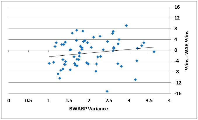
The horizontal axis looks at the weighted variance in BWARP, with more balanced lineups to the left and more unbalanced teams to the right. The vertical axis looks at whether the teams won more or less games than would have been predicted from adding up individual WARP. I’ve included a trend line, but my guess is that without it, it would be hard to guess from the scatterplot whether there was a positive or negative relationship between the two variables. In fact the slope coefficient is insignificant in a linear regression. If anything, there might be a weak relationship suggesting that it’s maybe a little better to have stars and scrubs than perfect roster balance, but I wouldn’t draw any conclusions from this data.
Let’s dig deeper. Scott’s original article was concerned with players who were “dragging the team down” with negative WARP. In looking through the data (some of it really painful), it becomes clear that it’s not usually a player or two who drag down the team, but a position that gets filled by a rotating cast of mediocrity. To allow for this, I calculated the percentage of plate appearances that were taken up by negative-WARP players and tried to see if there was a pattern of under-performance or over-performance there. The five seasons with the least and most plate appearances given to sub-zero BWARP players are listed in the table below.
| YEAR | W | L | Win% | WARP-Predicted Wins | % of PA to Negative-BWARP hitters | Over (Under) Achieved? |
| TOP 5 | ||||||
| 2008 | 97 | 64 | 0.602 | 94.0 | 6.4% | 3.0 |
| 1985 | 77 | 85 | 0.475 | 76.0 | 7.5% | 1.0 |
| 1988 | 77 | 86 | 0.472 | 80.3 | 7.9% | (3.3) |
| 1987 | 76 | 85 | 0.472 | 80.4 | 7.9% | (4.4) |
| 2009 | 83 | 78 | 0.516 | 82.7 | 8.1% | 0.3 |
| BOTTOM 5 | ||||||
| 1980 | 64 | 98 | 0.395 | 69.1 | 42.4% | (5.1) |
| 1965 | 72 | 90 | 0.444 | 69.1 | 44.0% | 2.9 |
| 1960 | 60 | 94 | 0.385 | 60.2 | 44.1% | (0.2) |
| 1981 | 38 | 68 | 0.358 | 42.8 | 44.5% | (4.8) |
| 1976 | 75 | 87 | 0.463 | 73.9 | 44.7% | 1.1 |
The first thing that jumped out was that the seasons with the fewest at-bats given to scrubs weren’t always very good seasons, and also that the good seasons didn’t necessarily avoid wasting plate appearances on scrubs. The 2008 team heads the list, but the other seasons that saw the Cubs reach the postseason are scattered around. The 2003 club (no. 17 in lowest percent of plate appearances given to sub-zero BWARP players) shows up next, followed by 2007 (no. 19), 1989 (no. 22), 1984 (no. 42), and 1998 (no. 52).
The 1980s era is represented again in the top portion of this table, but the two playoff seasons are missing. In 1984, the Cubs gave key roles to Larry Bowa and Keith Moreland despite negative BWARP, and in 1989, Vance Law, and to a lesser extent Doug Dascenzo, saw significant time despite performance below replacement level.
The bottom group, however, is dominated by some truly dreadful teams. If the pitcher’s spot is taken as a negative, a 44 percent rate means that three of your other eight spots are going to players who belong in the minors. It was worse in 1980, though, as four of the five primary starters (Lynn McGlothen +0.23 BWARP, Rick Reuschel +0.19, Doug Capilla +0.09, and Mike Krukow +0.00) avoided negative territory. Dennis Lamp, the fifth starter, amassed -0.05 BWARP, better than 11 position players who got more than his 72 plate appearances.
In all, though, there doesn’t seem to be much link between the share of your plate appearances going to bad hitters and your performance versus individual-based WARP expectancy. Here’s a plot comparing the percentage of plate appearances given to sub-zero BWARP hitters to how the team did relative to the sum of individual WARP.
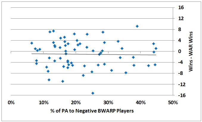
There is even less of a pattern in this scatterplot than there was in the first one we looked at. The trend line is virtually flat, so under- or over-performance doesn’t appear to depend on whether your WARP comes from a few star hitters or a bunch of decent ones.
I also wanted to examine whether lineup balance affected how teams performed relative to their Pythagorean expectations. Perhaps by sorting out some of the noise, a pattern would emerge. To do this, I plotted the weighted variance in BWARP against the difference between expected Pythagorean wins and expected wins based on WAR.
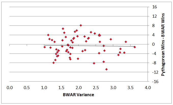
Again, there is not much of a pattern in the data at all. There is somewhat less dispersion in the data, but the trend line is essentially flat and neither the high-variance nor the low-variance teams systematically under-perform or over-perform what would be expected from the individual WARP totals.
The analysis here focuses on hitters, and it might be illuminating to repeat this exercise for pitchers or for an entire roster, but that is somewhat more complicated, and for another day. In the meantime, what might this tell us about roster construction? If anything, it seems to suggest that you ought to upgrade wherever you can, whether a position of apparent weakness, like second base for the Cubs during 2014, or a position of relative stability, like catcher during 2014. Perhaps it’s OK to trade a 25-year-old, three-time all-star shortstop in the right deal too.
Lead photo courtesy of Jesse Johnson-USA TODAY Sports