On Friday, August 14th, I found myself on Twitter. This happens a lot. It’s not localized to Fridays, honestly, or to Augusts, or to days which fall a fortnight into their respective months. It’s just something I do from time to time. And on this particular Friday, I spotted on my timeline the following tweet:
I am curious if Kyle Hendricks has more volatility in his outings than a typical starter or even typical BOR SP.
— dabynsky (@dabynsky) August 14, 2015
Instantly, I recognized two areas of commonality between myself and Mr. Dabynsky. First, we were both on Twitter on that Friday afternoon watching the Cubs. But second, we were both curious if Kyle Hendricks’ level of performance is more volatile, start to start, than that of the average starting pitcher. Dabynsky had been curious first, of course, but his curiosity sparked mine, and I promised to look into the situation.
The thinking—as I understand it—goes as follows: Hendricks is a pitcher who lives and dies on his command. He doesn’t have the pure stuff to get away with mistakes, and so when his command is off, he gets shelled. At first consideration, this admits the possibility that Hendricks should have both very good starts—when his command is on—and very bad starts—when his command is off. In other words, he should be highly volatile, in terms of his performance. But is he?
The beautiful thing about our 21st-century world—to be less subjective, one beautiful thing about our 21st-century world—is that we can gather and analyze vast tranches of data with far greater efficiency and economy than any of our predecessors before us. This isn’t localized to baseball research, of course: Thomas Picketty put it well in his introduction to Capital in the Twenty-First Century:
“In many cases, the technical difficulties [involved in their research] absorbed much of [my predecessor’s] energ[ies], taking precedence over analysis and interpretation.”
All of which is to say that all it took for me to answer Dabynsky’s question was a quick email sent to BP’s magnificent Rob McQuown, and then some time looking over the data he sent me to get a sense of what I was looking at. What it didn’t include, happily, was years of poring through musty archives, carefully noting down names and dates. In other words, I didn’t really do much here, but I’m presenting a few interesting things to you because I think you might like to know them.
First of all, you should know that the answer to Dabynsky’s question is NO. Let me tell you how I got there. In 2015, 106 starters (so far) have pitched at least 100 innings. I asked Rob to divide these pitchers into two tranches: one, including those pitchers in the top 80 percent of the 106 by WARP; another, including those pitchers in the bottom 20 percent by WARP. These tranches are intended to serve as proxies for ‘bottom of rotation starters’ (the second tranche) and ‘everyone else’ (the first). Hendricks, for his part, has thrown 131 1/3 innings this year, and his 1.88 WARP puts him in the ‘top 80 percent’ category. That adds a little wrinkle to the analysis right up front: Dabynsky thought Hendricks was a bottom of the rotation pitcher, but his performance actually suggests he’s better than that. For the Cubs, he’s a number four starter. For some other teams, he might not be. Turns out it doesn’t affect the results here, but it’s worth noting.
Anyway. So there we have Hendricks, sitting in the top 80 percent of starting pitchers in 2015. How has he gotten himself there? Well, it turns out that he’s averaged a mean Game Score (GS) of 52.22 over his 23 starts this season, with a standard deviation of 16.59. If you aren’t familiar with what a ‘Game Score’ is, you can become so here. It’s basically a measure of how good a pitchers’ start is on any particular day—the highest ever score is 153; the highest in a nine-inning game is 105. Again: Hendricks is averaging a GS of 52.22 this season, with a standard deviation in that score of 16.59. That’s pretty good, and has led to his strong WARP total. How does this compare to the pitchers in his tranche—the starters who are, like him, in the top 80 percent of the league?
Pretty similarly. In 2015, starting pitchers in the top 80 percent of WARP are averaging a mean GS of 55.00, with a standard deviation of 17.37. So Hendricks—whose volatility sits at 16.59, measured in terms of standard deviation—has actually been somewhat less volatile than the mean of his tranche. But just saying that isn’t enough. We know, now, that Hendricks’ volatility is 0.78 less (17.37 – 16.59 = 0.78) than the mean in 2015. But that alone doesn’t tell us much, because we don’t have a good sense of whether 0.78 is a big number or a small number in the context of the data that we’re looking at.
To understand that (whether 0.78 is big or small), we need to take the standard deviation of the standard deviation, and see how far Hendricks’ deviates from the norm. (It’s essentially a derivative, if that helps it make sense.) Anyway, I’ll save you the math: Since 1953, the mean standard deviation among pitchers in the ’80 percent’ tranche is 17.91, and the standard deviation of that number is 0.56. That means that Hendricks’ deviation of 0.78 has a z-score of 1.39 (0.78 / 0.56 = 1.39). Assuming a normal distribution, that suggests that Hendricks’ performance falls into the leftmost 10 percent of the normal curve: only 8.2 percent of pitchers have a greater deviation from the mean standard deviation than he does.
Whew! Back from the math. What we learned is what I said at the top: Hendricks is not just less volatile than the average starting pitcher of his type, he’s conspicuously less volatile than the average starting pitcher of his type—only eight percent of starters in 2015 are more consistent start to start than he is. QED. Hope you enjoyed this, Dabynsky.
***
I’ve mentioned it in this space before, but baseball research has a way of leading you down a rabbit hole. I’d started my research trying to answer a simple question about Kyle Hendricks, and ended up finding a lot of data about starting pitchers and volatility that doesn’t have much to do with him, directly, but might be interesting to the baseball reading public (or, at least, the really nerdy kind: my kind of people).
Here’s a thing, for example: the ten seasons since 1953 with the highest mean game scores recorded by the top 80 percent of starting pitchers, with the standard deviation of that value in the final column:
| Season | Mean GS | σ GS |
| 1968 | 58.50 | 18.06 |
| 1967 | 56.81 | 18.46 |
| 1972 | 56.79 | 18.23 |
| 1963 | 56.08 | 18.47 |
| 1971 | 55.90 | 18.20 |
| 1965 | 55.24 | 18.22 |
| 1966 | 55.24 | 18.46 |
| 1969 | 55.03 | 18.38 |
| 1964 | 55.02 | 18.62 |
| 2015 | 55.00 | 17.37 |
It’s comforting when research returns an answer that makes sense. We already knew that the late 1960s were a great time for starting pitching, and here’s more confirmation: every single score (save one) in the top 10 is from the period 1963-1972, with the top score—1968—coming in the Year of the Pitcher itself. And right there at number 10? Our very own 2015. We live in a pitching-rich era, to be sure.
And don’t think that it’s just the top of the class that’s pushing up the scores; the scores from the guys bringing up the rear tell a story about the era they pitched in, as well. Here are the top game scores by the bottom 20 percent of pitchers, again since 1953:
| Season | Mean GS | σ GS |
| 1968 | 50.19 | 17.46 |
| 1963 | 49.74 | 17.78 |
| 1969 | 48.53 | 16.87 |
| 1972 | 48.43 | 17.19 |
| 1959 | 47.76 | 18.87 |
| 1964 | 47.67 | 17.59 |
| 1992 | 47.67 | 15.73 |
| 2015 | 47.66 | 16.84 |
| 2014 | 47.46 | 16.80 |
| 1971 | 47.30 | 17.18 |
Seven of 10 years are the same as the ‘top 80 percent’ list, and the additions—1959, 1992, and 2014—are all to be reasonably expected. This gives us confidence that the data we’re looking at means something: it tracks with what we already know about eras, which is that the 1960s and early 1970s were extraordinarily good for pitchers, and that we’re in the best pitching era since then right now. It doesn’t matter whether you look at the top four-fifths of pitcher-seasons (the first chart) or the bottom fifth (the second). Eras matter, and we’re living in a pitcher’s world right now.
In fact, pitching was so dominant in the 1960s that the worst pitchers in 1968 (the bottom 20 percent) were better than the best pitchers in the late 1990s, when hitting ruled the roost. Here’s where the two tranches overlap:
| Season | Tranche | Mean GS | σ GS |
| (All the other ‘Top 80 percents’) | |||
| 1996 | Top 80% | 50.33 | 17.88 |
| 1968 | Bottom 20% | 50.19 | 17.46 |
| 2000 | Top 80% | 49.93 | 17.95 |
| 1963 | Bottom 20% | 49.74 | 17.78 |
| 1999 | Top 80% | 49.61 | 18.03 |
| (All the other ‘Bottom 20 percents’) | |||
So the best pitchers in 2000, for example, averaged a Game Score of 49.93, while the worst pitchers in 1968 averaged 50.19. Yeesh. Even Pedro couldn’t save the 2000 season from being a hitter’s paradise. Pretty cool stuff, if you ask me, and just goes to show you what numbers can tell you if you ask them interesting questions.
Anyway, one last little discussion in this monster of a piece. This one has to do with volatility; that’s where we started the conversation, after all. First, you might be interested to know that the best pitchers since 1953—those in tranche number one—had essentially the same standard deviation in their game score (17.90) as those in the lower tranche (17.15). The standard deviations of those standard deviations (what we used to check the Hendricks numbers, above) are also similar: 0.57 and 0.54, respectively. On that basis, I think we can be confident that we have pretty decent data. So which seasons had the highest volatility in pitcher performance? Here’s the top five:
| Season | Tranche | Mean GS | σ GS |
| 1955 | Top 80% | 52.13 | 18.90 |
| 1959 | Bottom 20% | 47.76 | 18.87 |
| 1960 | Top 80% | 53.15 | 18.79 |
| 1953 | Top 80% | 51.01 | 18.74 |
| 1974 | Top 80% | 53.67 | 18.68 |
And here’s the lowest:
| Season | Tranche | Mean GS | σ GS |
| 1992 | Bottom 20% | 47.67 | 15.73 |
| 2007 | Bottom 20% | 43.41 | 16.17 |
| 1956 | Bottom 20% | 44.97 | 16.19 |
| 2014 | Top 80% | 54.80 | 16.33 |
| 2011 | Bottom 20% | 46.26 | 16.42 |
Intriguingly, despite the similarities in the samples described a few paragraphs up, four of the top five least volatile scores came from pitchers in the ‘bad’ tranche, while four of the five most volatile scores came from pitchers in the ‘good’ tranche. I’m not sure what to make of that, and I welcome comments from any readers well-versed in statistics who might have a good idea of what’s going on. My working hypothesis is that, since the ’80 percent’ tranche is so much bigger, there’s more room for volatility, while the ’20 percent’ tranche is united by a common quality: they’re all bad, and consistently so. Just a guess.
***
In any event, there you have it. Kyle Hendricks, despite his fringe-average stuff and tendency to play with fire, has been no more volatile than his peers this season. In fact, he’s been quite a bit less volatile than his peers this season. Why that is, I can’t say. Could be a lot of things: an ability to avoid getting rattled, a tendency on the part of his manager to pull him if he’s getting shelled, or just pure random chance. That’s not the point of this piece. The point, in case I’ve lost it somewhere along the way (very possible) is to lay out the facts, and the fact is that Kyle Hendricks, with his calm demeanor and cool mound presence, is about as far from volatile as it gets. And, of course, that the 1960s were really good to pitchers.
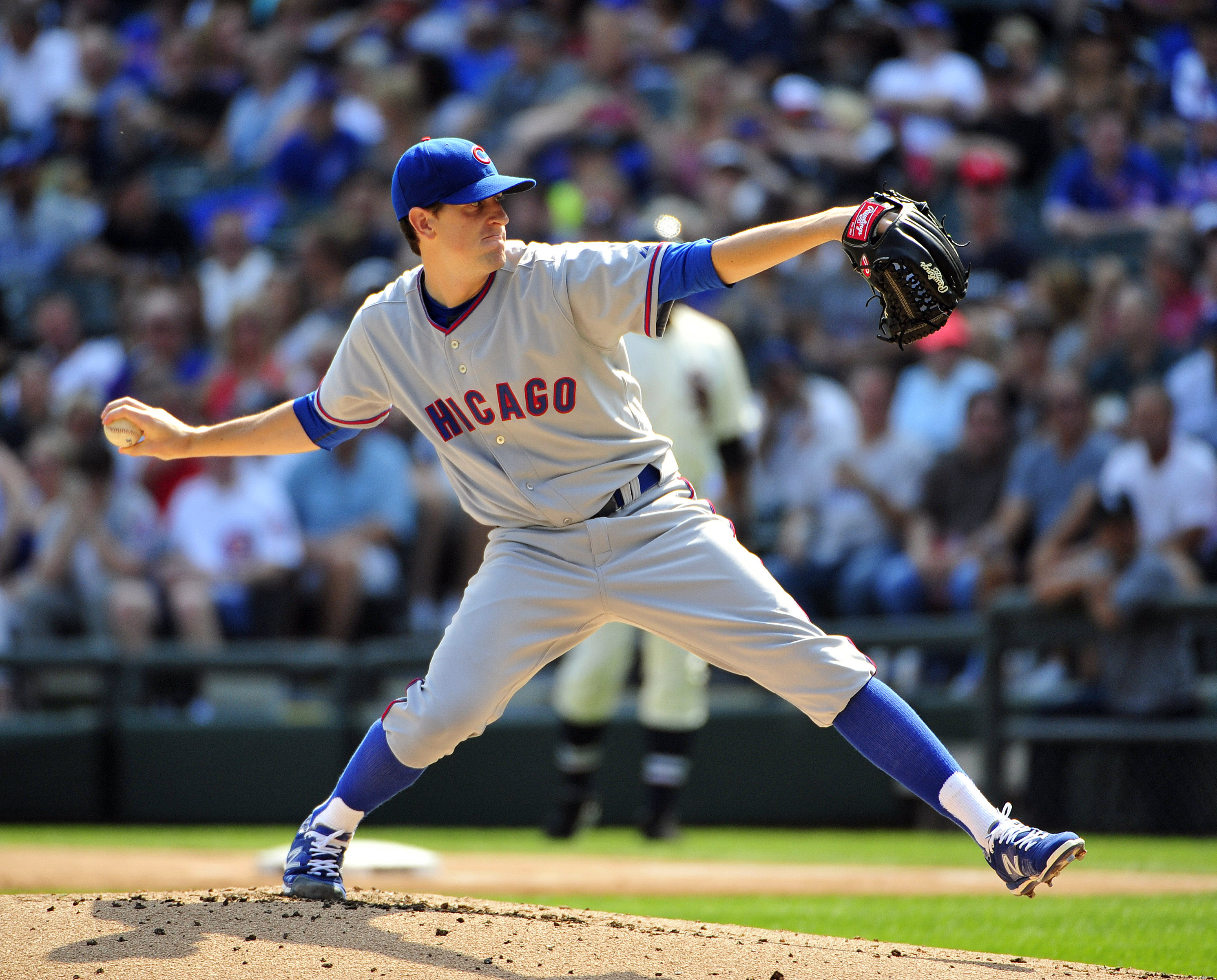
Lead photo courtesy David Banks-USA Today Sports.